UX/UI Designer

The Basics
Objective
To identify usability issues on Webtoon's current mobile apps and improve upon their current design.
Role: Research Lead
My Responsibilities
-
User Survey
-
User Interviews
-
C & C Analysis
-
Product Research
-
Affinity Mapping
-
Persona Development
-
Problem Statement
-
Feature Prioritization
-
Usability Testing
-
Sketching
-
UI Design Feedback
Duration: 2 Week Sprint
Introduction
What exactly is Webtoon?
Our first step involved learning more about Webtoons as a company. We scoured their website and wiki pages to learn more about the company’s history and primary goal. Key insights from our research were as follows:
Webtoon is a manga/comic reading platform created by Naver in South Korea in 2004. They have a desktop and mobile version of their platform. The original iOS and Android apps were released in July 2014 to the United States.
Our Design Process

Competitive Research

I decided to download and try out 2 other manga apps called Manga Zone and Shonen Jump. The intention was to compare the features/services offered by all 3 apps to identify key selling points. Key discoveries from this exercise:
-
The Self Publish Option on Webtoons is unique
-
Community Features like the series comment section were only found on Webtoons
-
Webtoons has a well thought out onboarding process using a “Find My Series” quiz
User Survey
Up next we began pre screening candidates using a user survey. We asked them questions about the devices they view Webtoons on to understand what platforms would be most useful to focus our efforts on. Based on 10 responses we discovered that users view Webtoons on iOS devices more often than android.


User Interviews
From there we conducted 3 user interviews to learn more about specific pain points each person had while using Webtoons. Here are some key insights based on the experience:

A Quick Detour
During our user interviews, multiple users suggested that I check out an app called Discord in order to analyze their community features. I did just that and was looking into their comment and group system in particular. I kept some of these features in mind to potentially use during our ideation phase later.

Synthesizing My Findings
Assembling an affinity map helped me to identify common user pain points and needs. Here are a couple of the standout takeaways.
-
Community features like the comment section were clearly important to Webtoons users
-
2/3 of users were unfamiliar with how the virtual currency (coin) system worked and preferred not to use it if possible.

Problem Statement & Persona
Now that I had the affinity map and comparative analysis completed, I started to form a persona and problem statement.
Problem Statement
Jason (our primary user) needs to be able to easily navigate and organize his webtoon experience to be able to access his favorite manga and fit some reading time into his busy schedule.

Feature Prioritization
Up next we did an exercise to determine what features we should focus on and which ones were lower priorities. We based this around the criteria of impact and difficulty to create.
Key Takeaways:
-
Optimizing Promo Codes was a low priority
-
Rebuilding the Coin (Virtual Currency) in the app wasn’t a high priority for users
-
Adding Forums would require more time than the 2 week sprint allowed

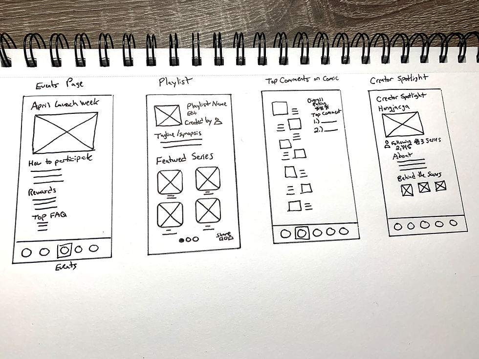
Ideation/Sketching
We conducted a design studio as a team and gave ourselves 30 minutes to sketch out possible app designs. We focused on conceptualizing the manga playlist, events page and bookmark features in particular.
Once we finished we discussed our results and eliminated designs based on feasibility and how seamlessly it would fit with Webtoon's current design.


User Flows
Now that we've decided which features we should focus on, David put together 2 possible user flows for our wireframes. The one you'll see below is the process for creating a new series playlist.

Low-Fidelity Wireframes
After finishing our sketches we created initial digital wireframes in preparation for our usability testing phase.

Usability Testing
We conducted usability tests with 3 users for our low-fidelity wireframe. These are a few takeaways from the sessions:

Revised Wireframes
We used the feedback from the usability testing to construct revised wireframes of our app.

Mock Up/High Fidelity Wireframes
From that point, we created high-fidelity versions of our wireframes as seen below.

Lessons Learned

Keep An Open Mind
I rediscovered that we should refrain from asking leading questions during user interviews so that my assumptions don't interfere with our research. Conducting proper research is about honest discovery. Therefore biases and assumptions should always be avoided.
I Am Not My User
Completing a task like sharing a playlist may be obvious to me when viewing our app, but that doesn't mean that other users will feel the same way. Our usability tests confirmed that we are not our users.
Proposed Next Steps
1.
More rounds of usability tests and iterations of the prototype
2.
Explore the possibility of adding forums
3.
Ideate on an in-app activity tracker
We had some difficulty finding enough Webtoons users to test our prototype during the 2-week sprint. Testing our app with 9 people would likely yield helpful feedback we could use to iterate further.
Both of these features were suggested by multiple users during our user interviews, but we put a pin in these due to the extra time needed to complete them.